Kazimir Malevich
White on White (1918)
The absolute silence of color. A white square on a white background, near-zero chromatic variability. The starting point of the scale.
Argira is a sound space. Your position within it determines what you hear. The artworks organize that space.
Argira is accessible with VoiceOver and TalkBack (in-page support in development). The full, already accessible experience is at Perceptual Map. In the meantime, navigate with Tab · Space to play · ⏹ Stop all always available.
We can't test Argira with every screen reader. If something doesn't work as expected — a button that isn't announced, audio that doesn't respond — you can tell us in the survey. Every report helps us improve.
Argira Station · Jose Ranero García
Peer-reviewed research · ICAD 2026
Sound Museum · Perceptual Space
A blind person can tell a Monet apart from a Kandinsky by sound alone.
Skip directly to the artworks (gallery)Every painting has a unique chromatic structure.
The conversion rule is fixed, but the sound texture that emerges is not designed.
The works are ordered from lowest to highest color variability.
Listen to the gradient: from silence to chaos.
Argira turns paintings into sound while respecting their real structure. A painting full of color sounds complex and high-pitched. A dark, quiet one sounds low and simple. It isn't an audio guide describing what you see — it's the structure of the painting translated into sound, with a mathematical correlation of r=0.8869.
Yes, sonification systems exist. But Argira began by applying Pearson's correlation (1895) and linear regression to measure the relationship between tone variability and sound complexity. Analyzing 45 works (peer-validated dataset, Zenodo v10), the correlation r = 0.8869 emerged from the data.
So that a blind person can tell a Monet apart from a Rothko by sound alone.
The sound is generated through a fixed mathematical rule, but the acoustic complexity that emerges isn't programmed: it's a physical consequence of harmonic interaction. It isn't a symbolic mapping like "blue = high-pitched," but a structural transformation that preserves chromatic variability.
White on White (1918)
The absolute silence of color. A white square on a white background, near-zero chromatic variability. The starting point of the scale.
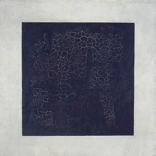
Black Square (1915)
Maximum contrast with the fewest possible colors. Absolute black against absolute white. Two tones, zero shades, the most elemental duality.
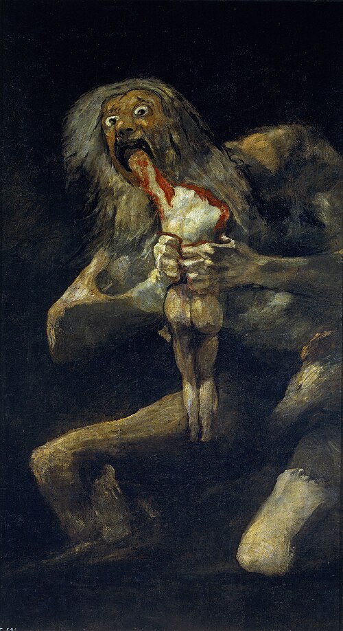
Saturn Devouring His Son (c. 1819–1823)
The densest darkness of the Black Paintings. Blacks, browns and a fleeting flash of flesh. Minimal chromatic variability but brutal in its impact.
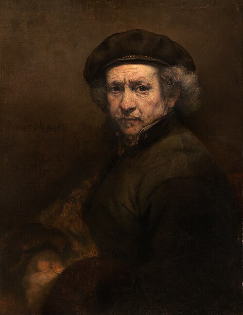
Self-Portrait (1659)
Pure chiaroscuro: ochres and browns in deep shadow. Minimal tonal variability, maximum psychological depth.
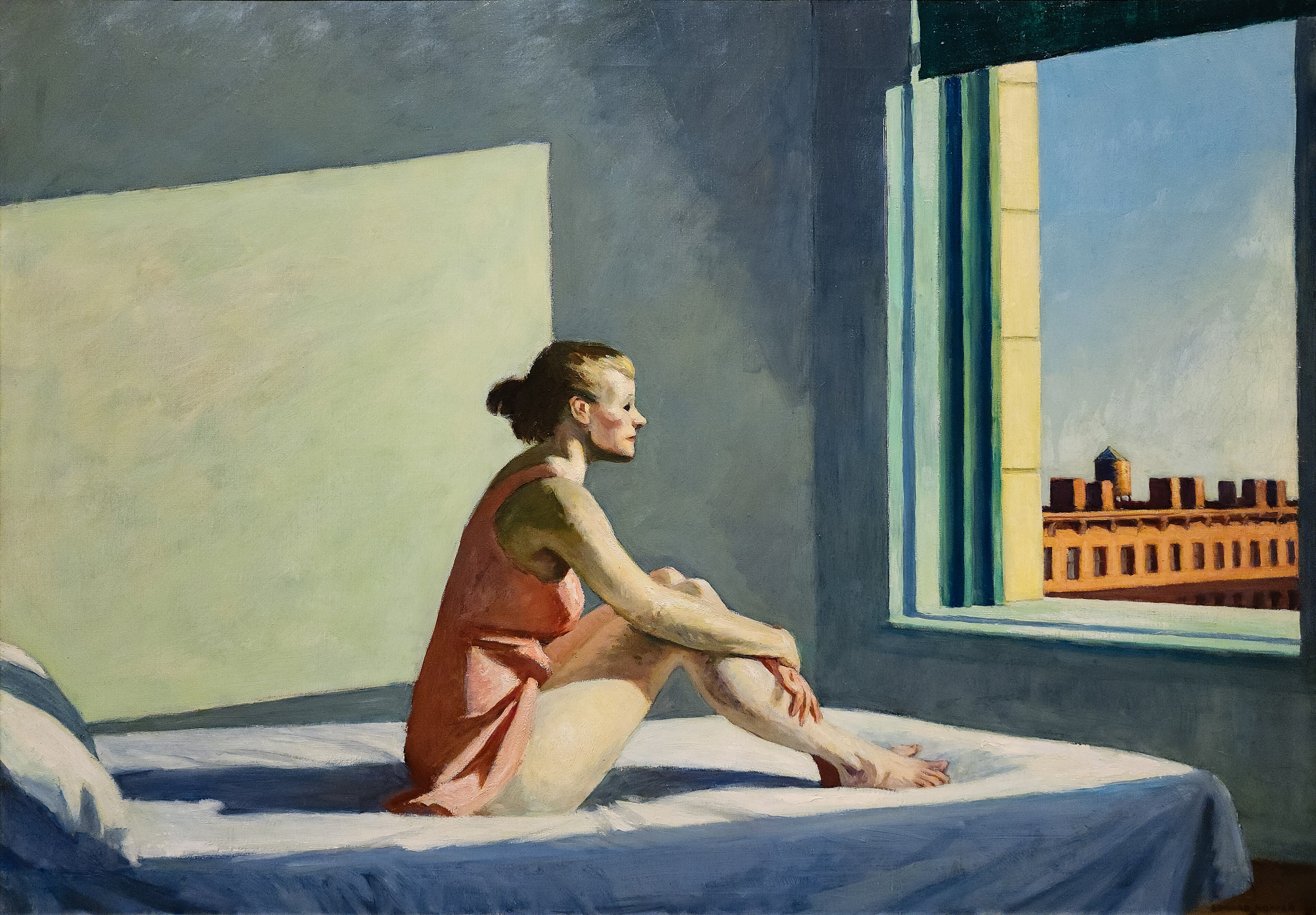
Morning Sun (1952)
Contained sunlight over whites and ochres. Hopper's American silence has a discreet palette, but warmer than the Baroque.
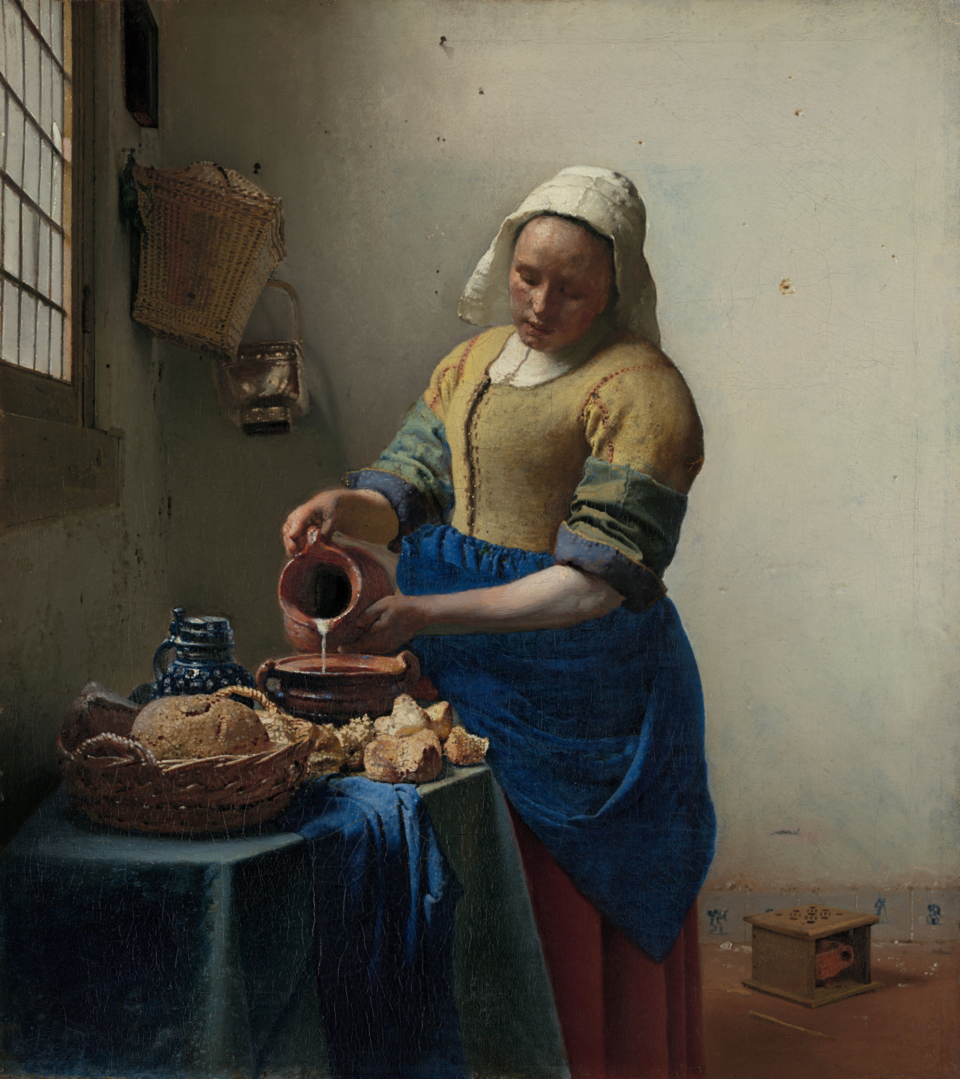
The Milkmaid (c. 1657–58)
Blue and yellow in Dutch balance. More variety than the dark Baroque, but contained within domestic intimacy.
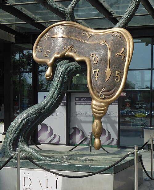
The Profile of Time – Vroclavo (1977)
Golden ochres and cool shadows. Dalí's surreal palette holds more variety than the Baroque, but is still contained.
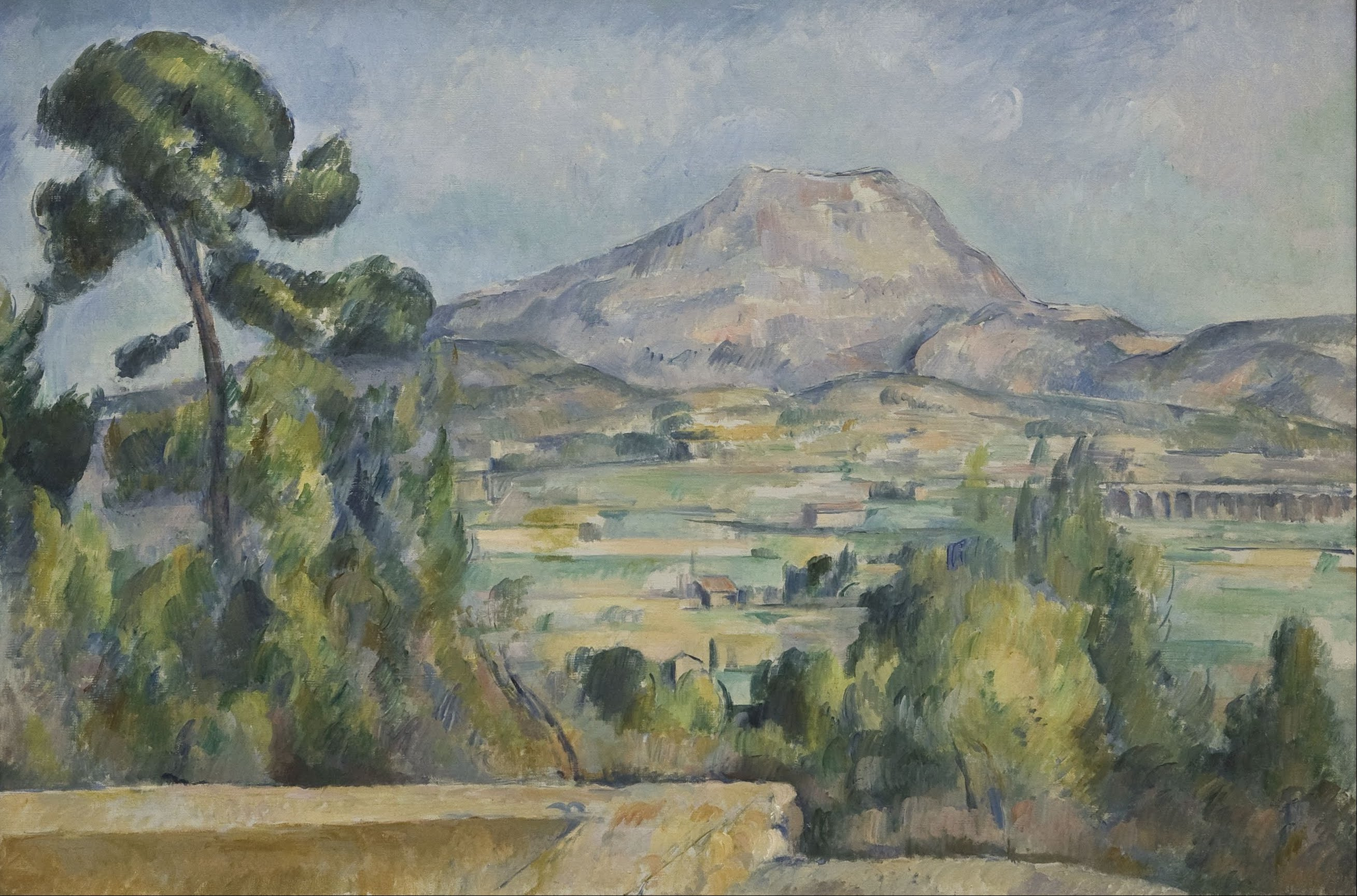
Mont Sainte-Victoire (c. 1902–04)
Structural greens, blues and ochres. Cézanne's geometry distributes color analytically.
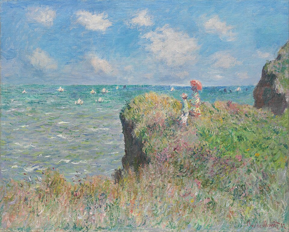
Cliff Walk at Pourville (1882)
Greens, blues and whites in Impressionist vibration. The fragmented brushstroke distributes color with moderate-to-high variety.
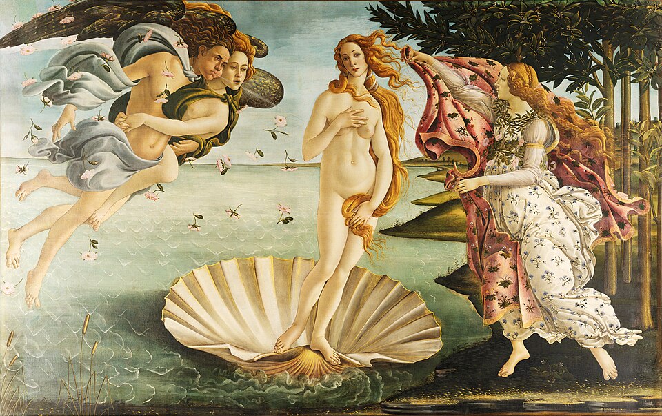
The Birth of Venus (c. 1484–86)
Blues, greens, pinks and golds of the Renaissance. Greater diversity than the Baroque, with elegant harmony.
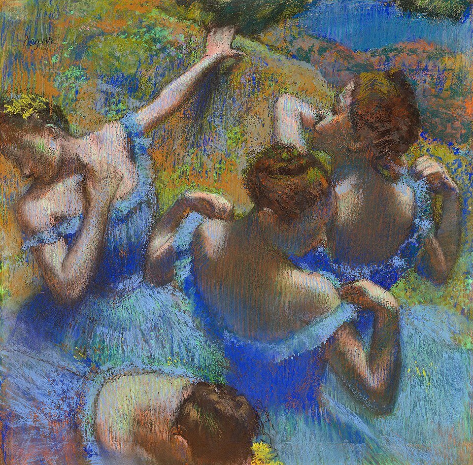
Blue Dancers (c. 1897)
Dominant blues with orange and green accents, a vibrant patchwork of color beneath an apparent monochrome surface.
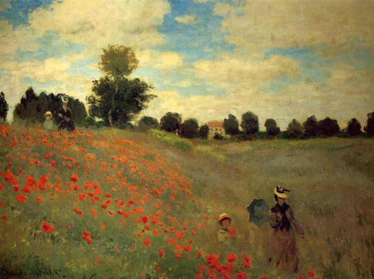
Poppies (1873)
Fiery reds over greens and blues. The contrast of complementary colors raises the chromatic variability.
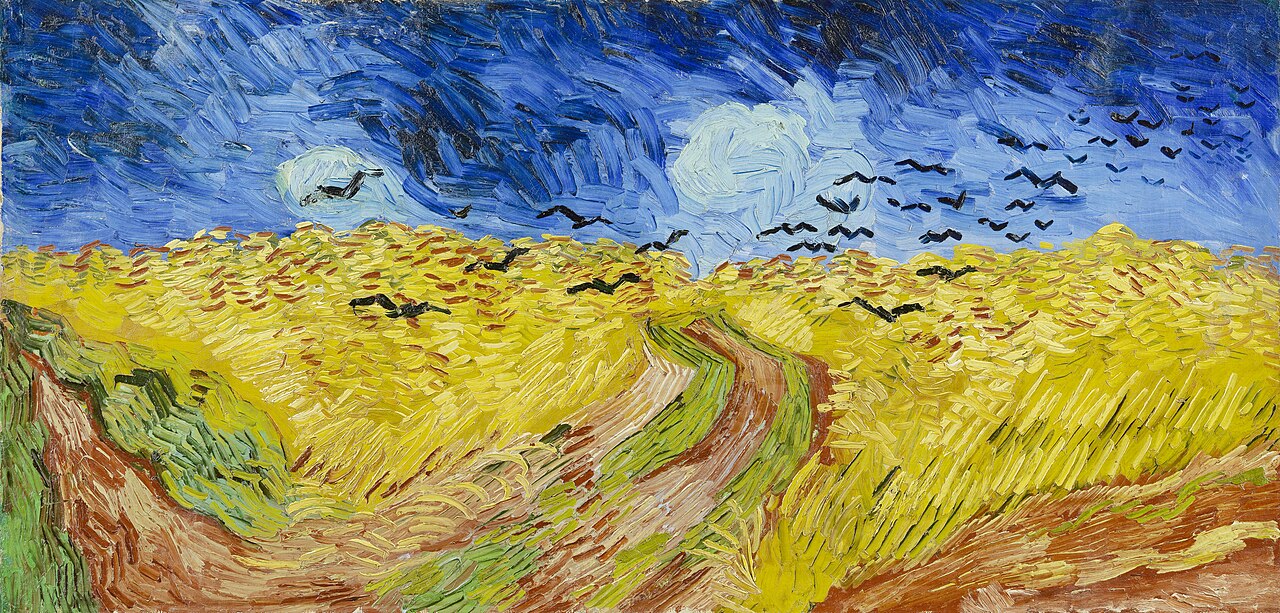
Wheatfield with Crows (1890)
Vibrant yellows against stormy blues. The Expressionist brushstroke reaches a high chromatic density.
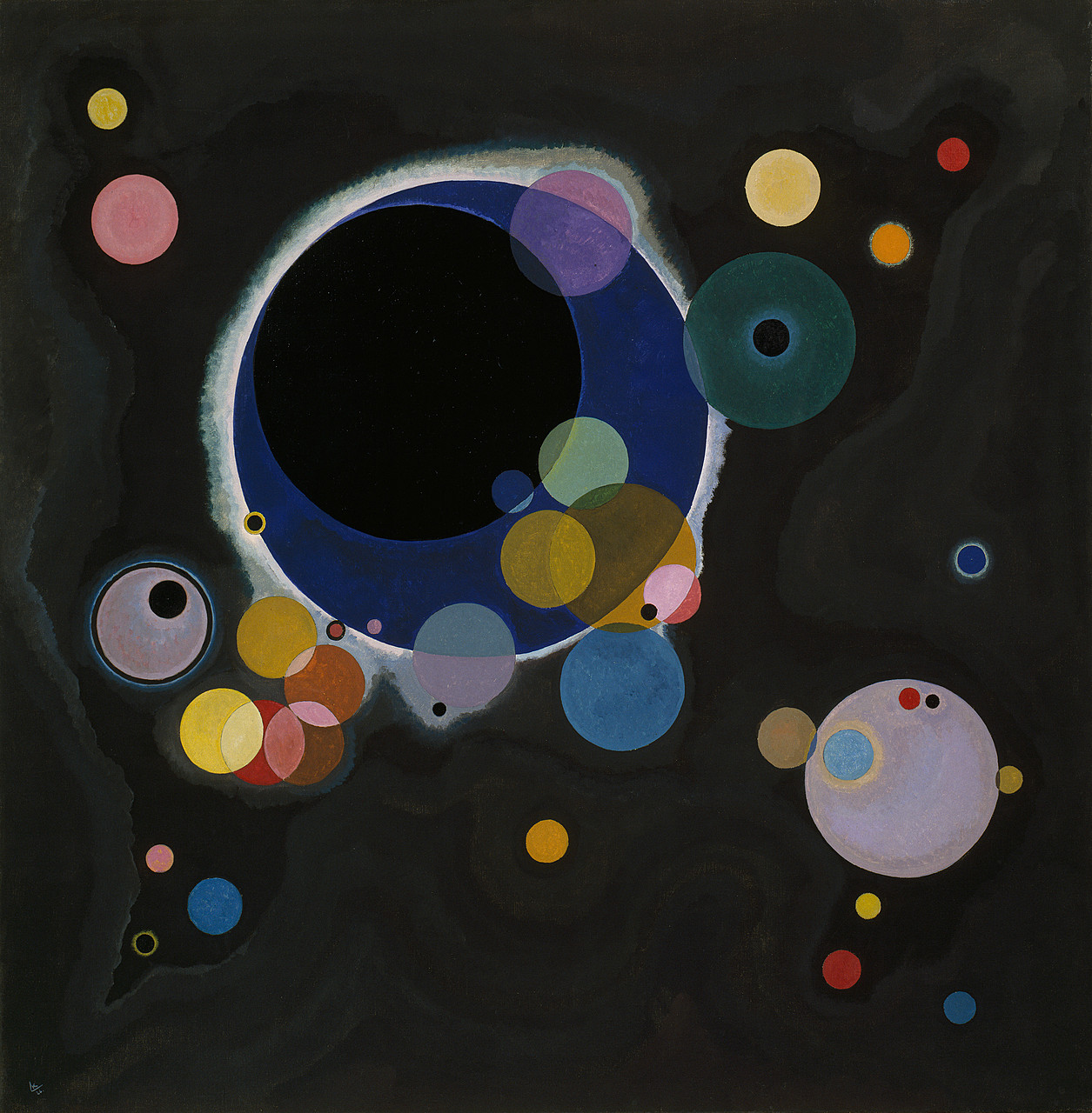
Several Circles (1926)
Circles of pure color on black, each a different tone, maximum saturation, radical contrast.
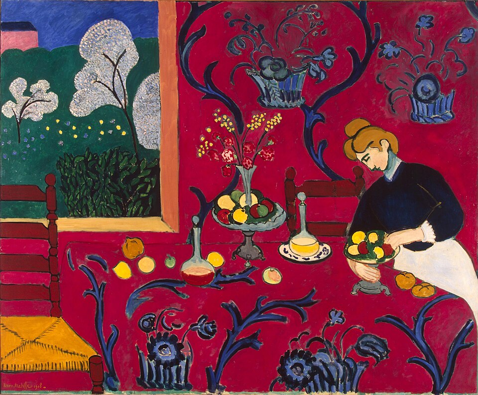
The Red Table (1908)
The Fauvist red that absorbs everything. Extreme saturation with blue arabesques.
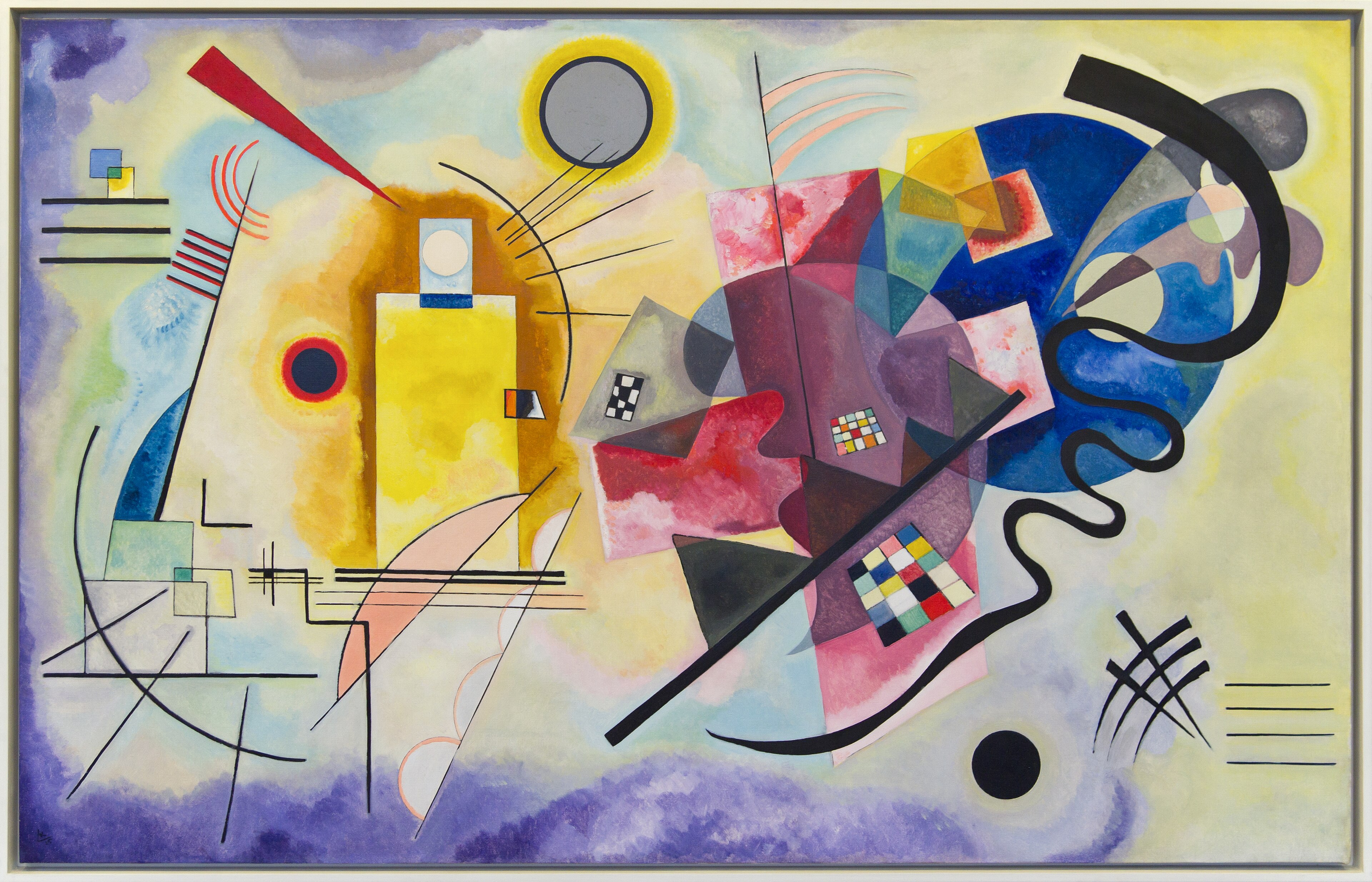
Yellow Red Blue (1925)
The pure chromatic triad: yellow, red, blue at maximum expression. The opposite pole to Malevich's silence.
hue_std → Spectral Dimension (Ds)
Each point is a work. The X axis is tone variability (hue_std), the Y axis is sound complexity (Ds). The red line is the linear regression. Data from Argira v3.5 (N=45), the version presented at ICAD 2026 and validated on Zenodo.
16 works shown · Correlation r = 0.8869 calculated on N = 45 works (full dataset, Argira v3.5) · Zenodo v10 ↗
At normal speed the ear receives the complexity all at once.
Slowing down is like using a magnifying glass on the chromatic texture —
the correlation r ≈ 0.89 is preserved.
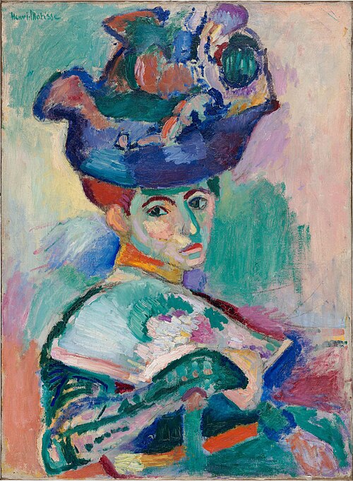
Matisse has the highest average saturation in the corpus; the magnifier reveals its harmonic texture.
Upload any painting or image.
The browser calculates its metrics and generates the acoustic signature, using the same formula as the dataset.